2 How people access the web
2.1 Mobile devices now account for 50% of webpage views in the UK
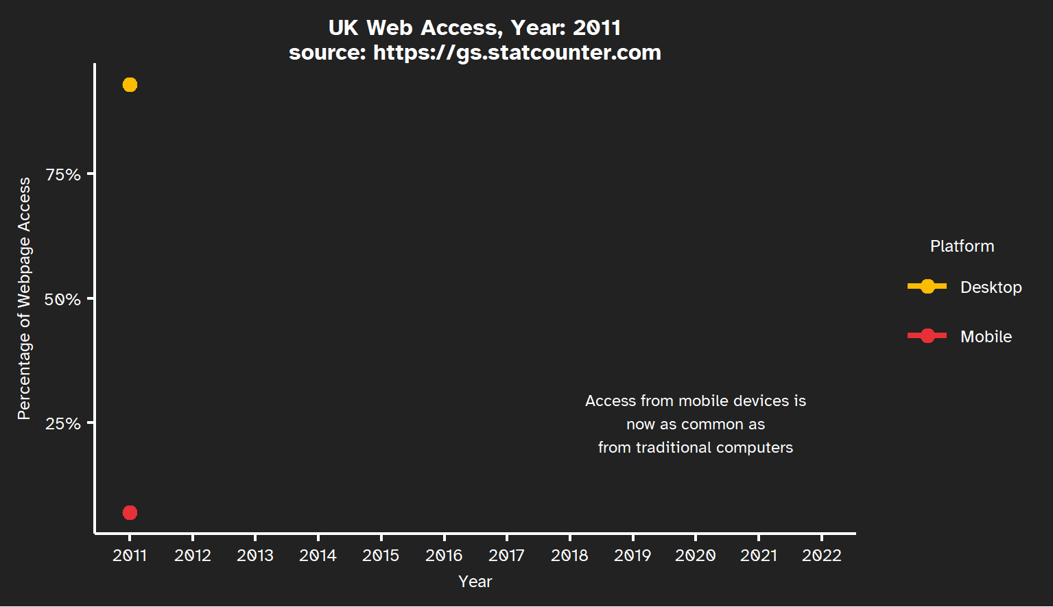
Figure 2.1 shows how in the last ten years there has been a change in the way people view the world wide web. In 2011 the majority of users accessed the web using desktop/laptop computers, but by 2022 we see mobile devices such as tablets and phones accounting for half of the views.
In November 2023 GOV.UK reported that over 60% of their visits are from mobile devices.
However, Google Analytics data for the University of Southampton Library pages shows that in the 12 months between January 2023 to January 2024 approximately 70% of visits are from devices with traditional keyboards. My assumption is that this reflects a greater proportion of users carrying out activities best suited to devices with keyboards and larger screens at the same time as they are accessing the Library website than across the web as a whole.
In general, when considering how to create effective webpages we need to consider how our pages work on both channels: computers with traditional keyboards and screens and mobile touch screen only devices.
2.2 Design webpages to provide a consistent experience across channels
Broadly speaking, these are the differences between desktop and mobile web experiences:
Desktops/Laptops are best for complex activities (using keyboard and mouse, multiple tabs etc.) and detail rich content (larger screens).
Mobile devices excel at on-the-go features (using GPS or camera) and media consumption (video, images, books, audio etc.), but are more compact and complex tasks can be more difficult using a touchscreen.
Our data indicates users accessing library pages are more likely to be using desktops than mobile devices for any given visit, but many users have both types of device and may visit using either and different times. Therefore if we have the choice, this suggests we should aim for consistency of user experience across channels, rather than optimising for one channel or device.
Consistency doesn’t mean identical, it means the user has the same core experience regardless of channel (and/or page).
What consistency means in practice is therefore determined by our overall design aims and adapting the guidance in Chapter 3, Chapter 4 and Chapter 5 for our specific page.
There is of course lots more detail on the NN/g: Optimizing for Context in the Omnichannel User Experience page, including discussions on when it’s appropriate to optimise for device rather than consistency.
2.3 Designing for accessibility
It’s impossible to anticipate every accessibility need, so an important consideration:
Is there a clear method by which users can contact you with accessibility issues?
For example, an email address or messaging service.
Common accessibility issues
These are the most common accessibility issues encountered by Digital Scholarship’s Kiki Kuijjer:
Embedded links not distinguishable
Links embedded in text should be distinguishable from the surrounding text - either through styling (like an underline) or by making sure there is sufficient contrast with the surrounding text (see Accessibility Insights: Link in text block).
Insufficient colour contrast
Text, graphics, and user interface components must have sufficient colour contrast with the background (see the WebAIM Contrast Checker for required contrast ratios).
Alt-text missing
Images must have alt-text, unless they are decorative, in which case a null text alternative (alt=““) must be provided (See Section 5.3 and the WAI Images Tutorial).
Not keyboard accessible
Users must be able to navigate to navigate to all interactive components using a keyboard only (see WCAG Success Criterion 2.1.1: Keyboard (Level A)).
You can check your page for potential issues using an accessibility checker such as the WAVE Web Accessibility Evaluation Tool.
The World Wide Web Consortium (W3C) Web Content Accessibility Guidelines (WCAG) 2.2 are the official source of recommendations for web accessibility to improve inclusion of users with impairments to their vision, hearing, mobility, thinking or understanding
These guidelines follow four design principles that pages should be:
- Perceivable
- Operable
- Understandable
- Robust
The University of Southampton is expected to meet the WCAG AA standard for accessibility.
The WCAG provide a Quick Reference which has examples, but is ironically a bit overwhelming! Utah University host WebAIM provide an in-depth WCAG 2.2. AA checklist too that is slightly easier to use.
WebAIM also provide many tools, including the previously mentioned WAVE Web Accessibility Evaluation Tool which highlights potential issues on your page.
As library pages primarily consist of text and links, the University of Washington Accessibility Checklist may provide sufficiently concise guidance.
It may not be possible to achieve perfect accessibility due to the trade-off one encounters between competing user needs, but the important thing is to try.